Reflecting on Innovative Projects at Esri: A Retrospective

A couple of years ago, I put together a sizzle reel to showcase some of the projects I had the pleasure of working on at Esri between 2021-2022. It was a whirlwind of creativity, collaboration, and problem-solving, but I realized I didn’t share much about these projects at the time. So, I’m taking a moment to reflect on the journey and give you a peek behind the scenes at some of the work that I’m particularly proud of. Give the sizzle reel a watch and then I will share some thoughts and stories about the different projects.
Animated Symbols: Bringing Maps to Life#
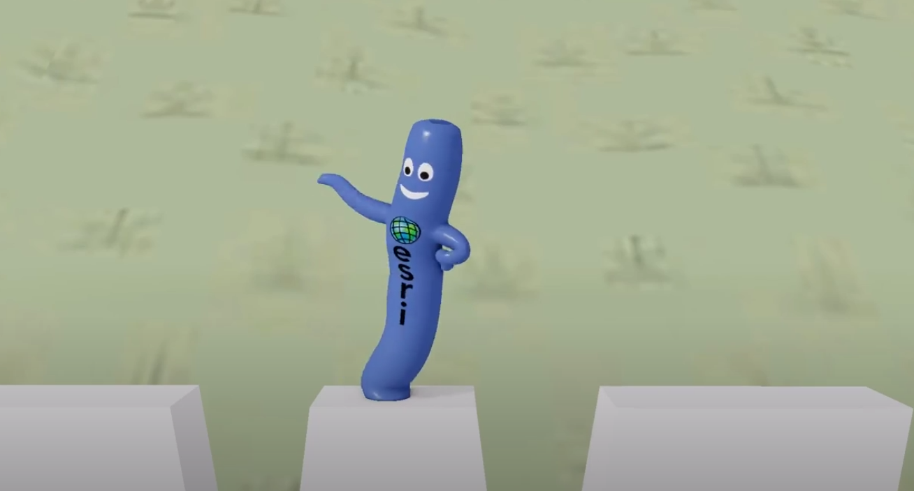
One of the most exciting projects I worked on was the development of Animated Symbols. This was a game-changer in terms of adding life and interactivity to both 2D and 3D maps. Imagine your static map suddenly bursting with movement: wind turbines spinning, vehicles moving along roads, or abstract symbols like pulses or flashes. It was a thrill to think about the various use cases where animated symbols could make maps more engaging and informative.
However, with great power comes great responsibility (and a fair bit of challenge). One of the key hurdles was figuring out how users would want to create and add these animations. We had to ensure that users could apply animations to static symbols within ArcGIS Pro, while also allowing them to import animated assets created outside of the platform. This required us to set clear performance KPIs and define the types of user-generated content that would be supported.
The developers were nothing short of phenomenal in integrating these animated symbols into the rendering pipeline. They added support for a variety of animated features, including animated GIFs, 3D transform animations, skeletal animations, and morph targets. The result? A powerful toolset that allowed users to create dynamic, eye-catching maps that tell a richer story.
Animated Water: Enhancing Realism in 3D Maps#
Next up is the Animated Water project, which was all about upping the ante on visual quality and realism in 3D maps. Water is one of those elements that can either make or break the immersion in a 3D environment. We wanted to make sure that our water looked and behaved as realistically as possible, whether it was a vast ocean or a small local lake.
The challenge here was twofold: the water needed to be easily configurable by users and it had to perform well across a range of scenarios, from large-scale global maps to small, localized 3D scenes. The water animation was fully simulated, so performance was a critical factor. We had to strike the right balance between visual fidelity and efficiency, ensuring that the water looked great without bogging down the system.
Scene Effects: Unleashing Creativity#
Let’s switch gears and talk about Scene Effects, which came a bit later in the video but earlier in the development process. The goal here was to give users more creative tools to enhance the visual quality of their 3D maps. This was the first time I had the pleasure of working with the developers at Esri’s Ankara R&D Center, and I have to say, they exceeded all expectations.
We developed about a dozen shader-based effects that added extra processing to the final rendered images produced by 3D maps. The team was brimming with ideas, and it was a challenge in itself to narrow down which effects would be the most useful for our users. Ultimately, we selected a set of effects that provided a good mix of functionality and creativity, allowing users to make their 3D scenes even more impactful.
Color Vision Deficiency Simulator: Accessibility at the Forefront#
With the Scene Effects pipeline in place, we quickly realized that we had an opportunity to address a highly-requested accessibility feature. Users had been asking for a way to see their maps through the eyes of someone with a color vision deficiency (CVD), and we were determined to make it happen within that same release.
Approximately 8% of men have some form of CVD, which can make reading maps difficult if the color palette isn’t CVD-friendly. This is especially critical for maps used in emergency situations, where clarity and accessibility can save lives. The Color Vision Deficiency Simulator was created to help map authors preview their maps with different types of CVD, enabling them to make informed decisions about their color choices. It was an amazing experience to learn more about CVD throughout the development of what turned out to be a hugely impactful feature.
Conclusion#
Looking back, I thoroughly enjoyed working on these projects. Each one presented its own set of challenges and learning opportunities, but they all shared a common thread: collaboration with incredibly talented developers and product engineers who turned ideas into reality. It’s one thing to have a vision, but it’s another to see it come to life through the hard work and dedication of a team.
As I continue to move forward in my career, I carry with me the lessons learned and the memories made during this period at Esri. It was a time of growth, innovation, and, most importantly, fun. Here’s to more projects that challenge and inspire us to create something truly extraordinary.